Sheba Hospital · 2022
Sheba Hospital Emergency Room Dashboard
I designed a real-time ER dashboard for Sheba Hospital so doctors can prioritize patients and act on critical data at a glance.
Introduction
Medical emergencies require quick, informed decisions. We designed a real-time dashboard for Sheba Hospital's ER so doctors can act on patient data at a glance.
We worked as a team of three UX designers together with Unit 8200 and the Center for Digital Innovation at Sheba Hospital.
Context
ER goal: decide the next step for every patient
Beyond saving lives in critical moments, the ER aims to move each patient to the right next stage: discharge or hospital admission. To keep patients moving through the ER, it must stay clear, and that depends on accurate, quick decisions for every patient.
The working strategy: completing the picture
To reach that goal, doctors gather additional patient information from exams, imaging, or specialist referral. With dozens of patients at once, they constantly face two decisions:
Which patient to focus on?
What follow-up care is needed?
Challenge & solution
Doctors lacked a decision-making tool that fit ER workflow and load, so we designed a real-time dashboard on ER patient data that helps them prioritize tasks and decide the next step for each patient, faster and with less effort.
Research
"In the ER, the load is consistent, everything is always buzzing..."
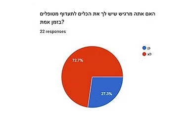
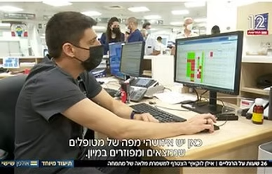
Research methods


Insights
Intensive working environment
You don't know what's behind the doors. The load is consistent, always buzzing...
The ER's heavy workload, along with constant movement and beeping machines, makes it a hectic environment.
Inadequate current system
The hospital system isn't adapted to the ER flow...
The hospital's existing information system holds medical data for all patients and is crucial for complex ER decisions, but its information architecture doesn't fit the ER workflow. Basic information is hard to access, notifications are missing, and slow performance with an outdated design add friction.
The doctor's character
Cognitive load
There is always new information, there is always something happening that you need to know about...
Constant distractions and a huge volume of information leave ER doctors with scarce, easily interrupted attention for critical decisions.
Poor task prioritization
I saw the patient's wife and remembered that I should have looked at his blood tests.
Without reliable task tools, doctors fall back on handwritten notes. That makes it hard to tell completed from pending work, and less urgent cases can get overlooked.
Information capacity
To an outside observer it looks chaotic, but I can assure you that everyone knows exactly what they are doing.
While holding an immense amount of medical information may seem overwhelming to non-medical professionals, it doesn't bother doctors since they find it straightforward and clear.
Goals
What do we want to achieve?
The new dashboard gives doctors the real-time information they need to see which tasks to do and how urgent they are.
We hypothesized that distilling the data would speed decisions in two ways:
Shortening decision time
Reducing decision effort
That supports the ER's goal - a correct, quick decision for every patient. The dashboard may also improve ER function by:
- Fewer mistakes during a shift.
- Smoother handoffs between shifts.
Design guidelines
Our research led to a set of guidelines that shaped every design decision.
- Minimal interaction — Our design goal was minimal user interaction, to avoid adding complexity to the workflows.
- Dense, but only necessary data — A passive, glanceable interface needs a lot of data on screen, but doctors can read that density as one coherent picture.
- We will not prioritize patients — ER's urgency index (ESI) is controversial, so using it to sort patients on the dashboard is ethically problematic. Instead, we visually highlight abnormal data and leave prioritization to doctors.
- No replacement of current system — The existing system remains essential for documentation—we designed a dashboard that complements it, not a replacement.
Final Designs
Design for a glance: all the necessary data, minimal interaction
ER view by spatial simulation
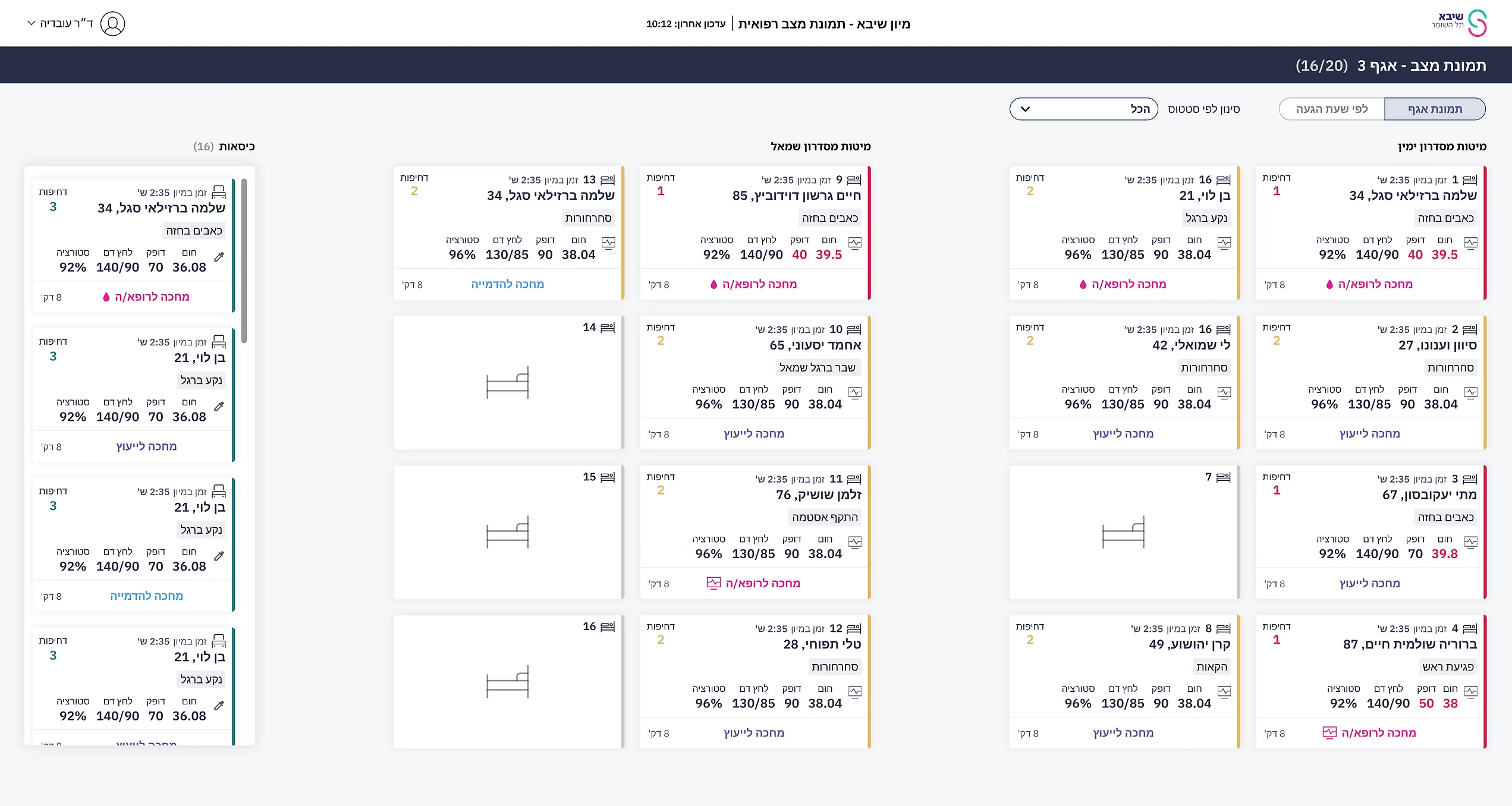
We designed a display that mirrors the ER floor, with two corridors and numbered beds on either side.
Chair patients were harder to manage - they sit in unnumbered seats, move around, or leave - so we couldn't map them like beds. We gave them a dedicated left column, separated from the bed grid, to make them easier to track. Doctors confirmed the layout in usability tests.
Filter by status
Managing patients by task, not just by bed, was hard in a busy ER. We added a status filter so doctors can group everyone waiting on imaging, blood tests, and similar work.
Zoom-in: patient card

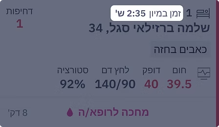
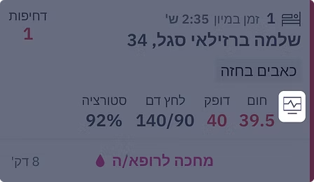
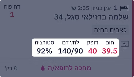
Each patient card shows only the data needed at a glance. Reading status, indices, and time together, doctors can tell whether they need to approach that patient now.
Card elements
1. Time spent in ER
Displaying the patient's length of stay in the ER saves doctors from time calculations, unlike arrival time display in the existing system.


ER view by arrival time
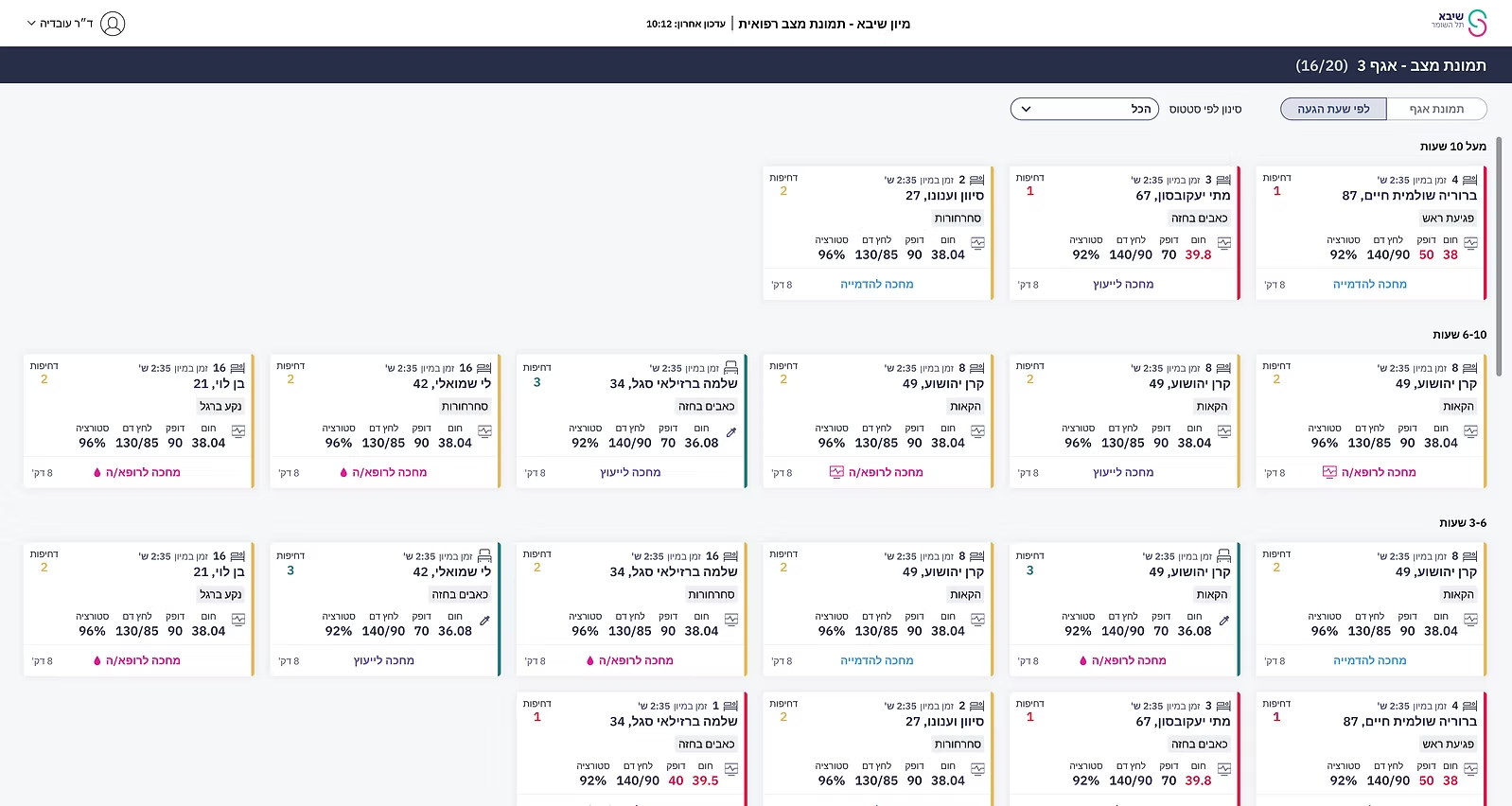
We also offered an arrival-time view: patients who've waited longest rise to the top, supporting a First-In-First-Out pass when nothing is more urgent.
Chair patients, who tend to get less attention in the spatial view, get a clear place here by arrival time.
Patient panel
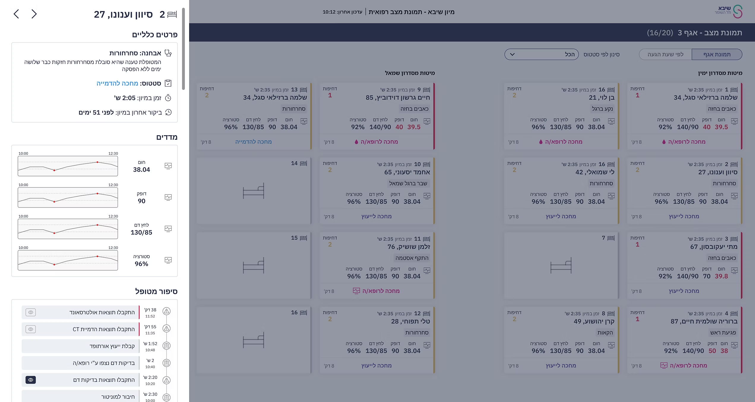
Clicking a patient card in the dashboard opens a deeper panel with more detail on that patient.
Indices change
Indices already lived in the hospital systems, so we proposed showing how they change over time. Doctors found the trend more useful than a single reading.
Patient story
We came up with an event log so doctors can scan what already happened. Feedback was stronger than we expected, and usability testing pushed us further: an eye icon on the left marks whether a task is done, which clarified pending work in tests.
Future Plans
Tablet version
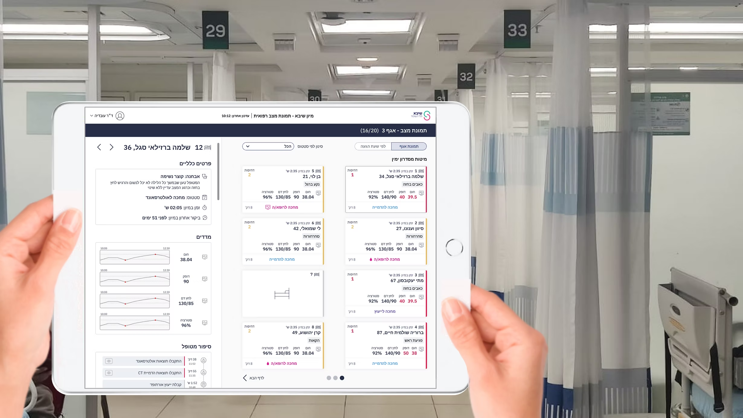
ER work ran on desktop, so that was our primary interface. We saw that doctors still needed support on the floor, not only at the desk, so we also proposed a complementary tablet.
Usability tests shifted the tablet from a responsive shrink of desktop to a rounds tool: doctors move patient to patient in quieter moments, so the patient panel stays fixed for in-depth focus, while desktop still shows the full census at once.
Final Thoughts
Observing users in their real environment showed us which design rules would actually work
Working on Sheba’s ER dashboard meant designing for extreme cognitive load, not for an ideal, quiet screen.
Collaborating with clinicians and testing in context is what made the design stronger: minimal interaction, dense but necessary data, and highlighting anomalies without sorting patients for the doctors.
It was rewarding to work on something with real stakes for patient care and to see how much better the design became once we left the desk and watched doctors in the ER.